
Navigation Bar and Footer
The 'Header' tab of your website lets you configure the navigation items that appear across your website, on action pages and landing pages. To open it, click 'Pages' in the sidebar and open your website.
Navigation Items
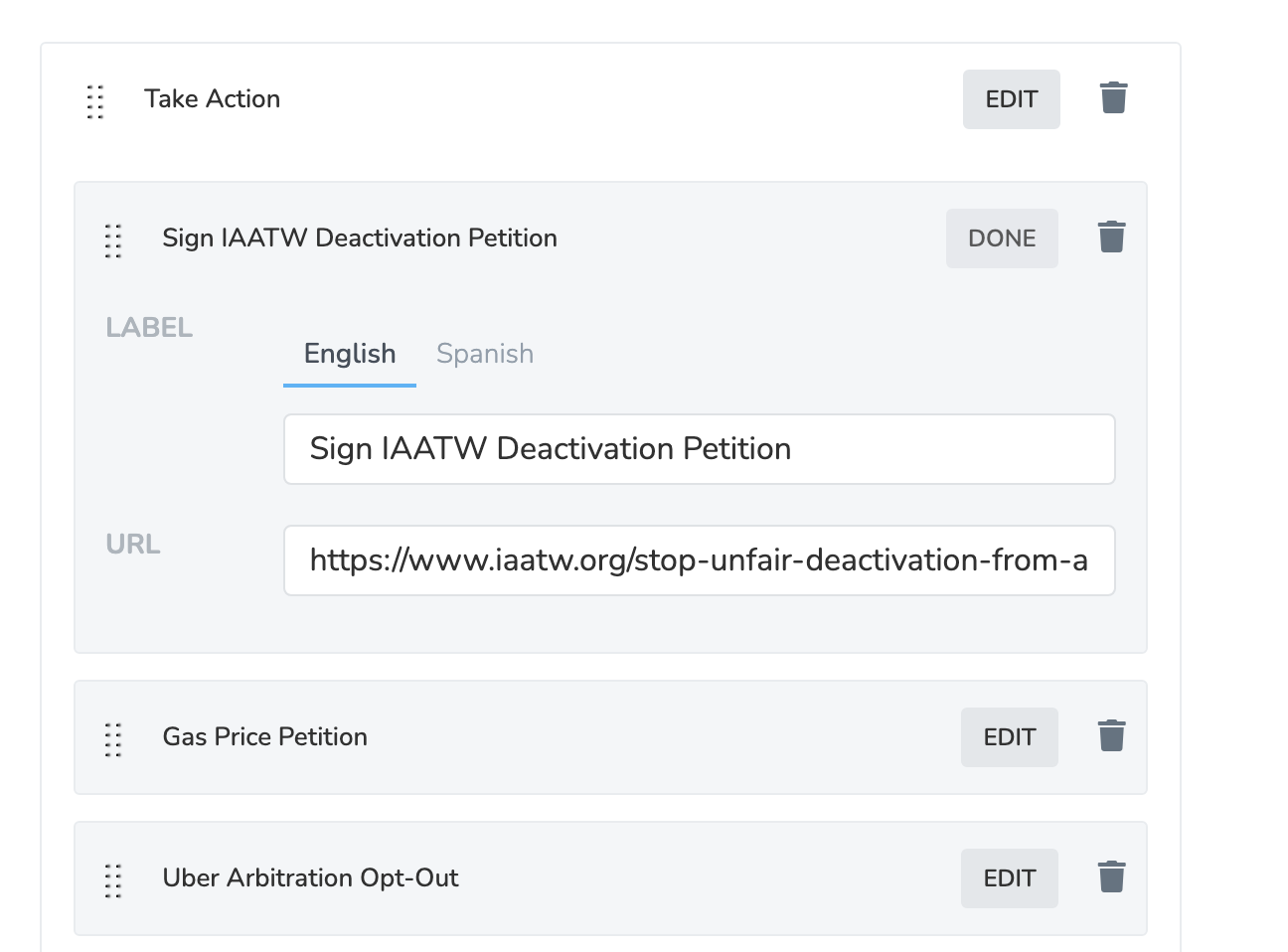
Add navigation items from the 'Add New Navigation Item' dropdown, then click 'Save Navbar'. A Menu Item is a link with a label and URL. A Submenu Container is a dropdown that holds multiple menu items.


Multi-Language Navigation Labels
The Label field of each navigation item shows a tab for each Supported Language of the website's chapters. Use the tabs to enter translated labels (e.g. "Home" in English and "Inicio" in Spanish). To add a language, open one of the website's chapters in Settings > Chapter Structure, add it under Supported Languages, and save.
If you only see English, the website's chapters only have English enabled.
Branding
Choose how the logo and organization name display:
| Option | Behavior |
|---|---|
| Always Show Website Branding | Same logo/name for all visitors (default) |
| Chapter Branding, Fallback to Organization | Shows the visitor's Chapter branding if logged in, otherwise the page's chapter or organization |
| Chapter Branding, Fallback to Website | Shows Chapter branding if logged in, otherwise Website branding |
Colors
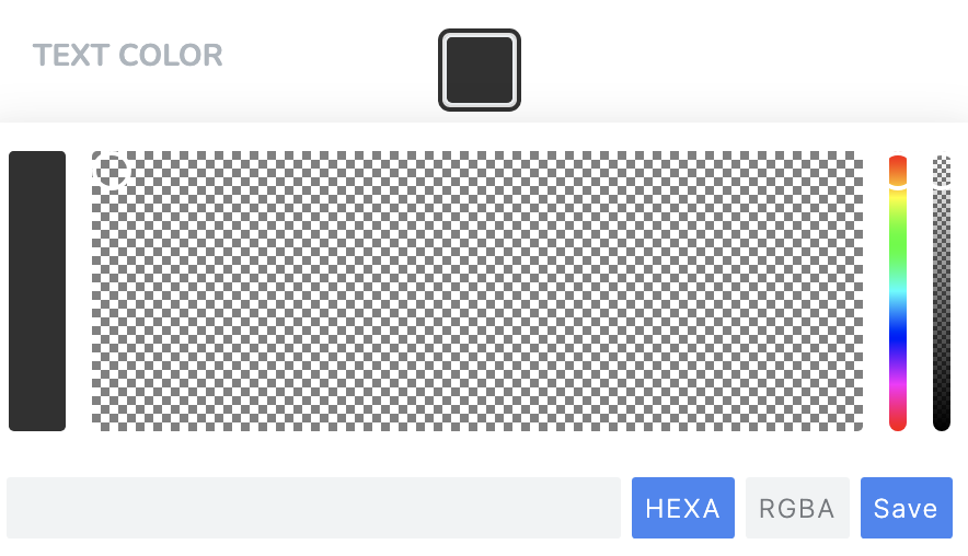
Set the navigation bar color, except on page builder pages.
Footer
The 'Footer' section has one field, 'Footer HTML'. New pages copy it, so later edits do not change existing pages. To change one page, edit 'Footer HTML' on its 'Details' tab, or its Footer section.
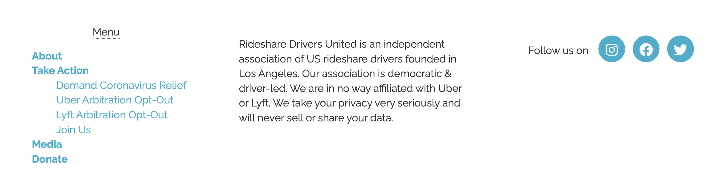
On page builder pages, 'Show Social Icons' in the Navigation or Footer section shows icons from your website's social media settings.
Updated 5 days ago